
Hang 10
How to provide accessible and easy-to-understand weather data for surfing enthusiasts?
Project Type
Career Foundry Course
UX Immersion Program
Tools
Figma
Miro
Project Duration
4 months
My Role
Sole UX Designer and Researcher
Contribution
User Research
Wireframing
Prototyping
Accessibility Design
Interaction Design
Overview
High Level Design Thinking Framework Benchmarks


Project Context
This project was the main focus of my UX Design bootcamp through Career Foundry. The direction of the prototype was shaped via mentor guidance and loose development criteria through the bootcamp curriculum. All of the research and design work was carried out and implemented by myself and critiques were provided by an industry mentor as well as an industry tutor throughout the course, giving helpful tips on the research and designs that I had carried out.
Background
As our lives get busier it is harder and harder to find time for what makes us happy and meet up with friends. When we plan something, it is imperative that we are able to fit it into our lives and it isn’t canceled by forces out of our control such as weather or safety concerns. Through personal experience living on the East Coast and also having a brother who surfs on the West Coast, looking into the surfing app market steered the focus of this project.
For these reasons, this project wanted to explore the question…
How do surfers plan surfing trips around their schedules, the weather forecast and any other safety factors?
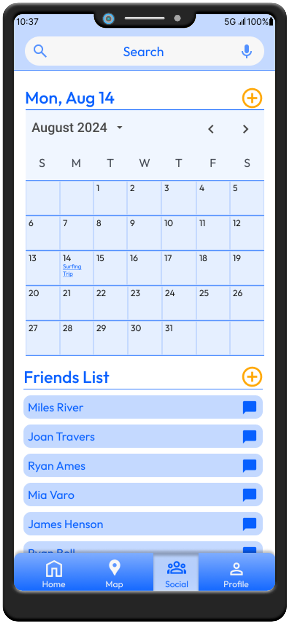
High-Fidelity Preview


Surfing Calendar Page
Friends List Page


Live Weather Forecast Map Page
Home Page

Profile Page
Setting the Stage
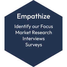
Step 1: Empathize
It was imperative to understand the space in the market and our potential user base. Two major potential competitors were identified within the market space. The first of these was Windy.app, which is focused on a live weather map that offers real time visual data to the user. The second was Surfline, which uses live web cams at beaches for surfers to verify weather conditions through a clear picture. Surfline also had bought out a service called MagicSeaweed, which multiple users had expressed preference for over Surfline. This opened an interesting opportunity, as there were many examples of MagicSeaweed UI on reddit, so integrating some of the visual concepts were used throughout this project to appeal to the users that expressed wanting a return to this type of visual design!
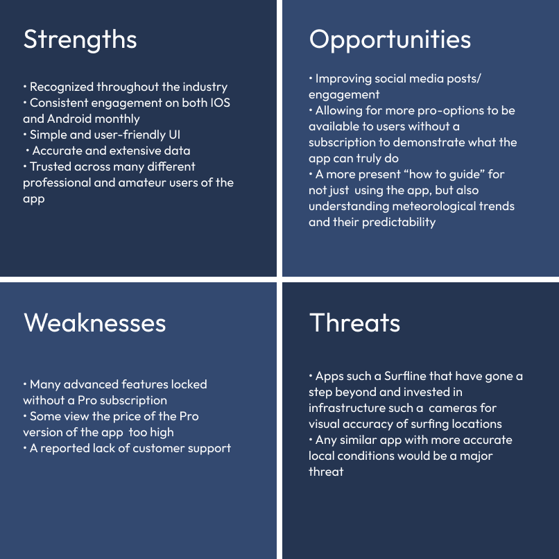
Major Market Competitors

Surfline SWOT Profile
Windy.app SWOT Profile
Our User Base
To reach out to our potential user base, surveys and interviews were utilized in conjunction with each other. Both of these methods revealed that a majority of our potential user base consists of casual surfers who surf 1-3 times per week on average. These users were focused on weather conditions at their location and were not worried about time spent on their commute to the surfing location. They also visit the same locations consistently and don’t usually mix it up.
Additionally, they already used Surfline as their main app but were not satisfied with the UI or price overall. Two of our users that we interviewed actually cited preferring the UI of MagicSeaweed, which is the company that was bought out by Surfline. MagicSeaweed boasted a simple and clean UI that conveyed information clearly to the user without excessive data being presented to users bogging down their experience within the application. Our users also expressed their frustration over trying to plan surfing trips with friends.
Shaping the direction of our prototype by asking…
How might we make it easier for our users to plan surfing trips with friends while avoiding an exorbitant price tag and over complicated UI?
Putting the User at the Center of the Process
Step 2: Define
User Personas
Based off the user research we created two user personas to guide our development of Hang 10, and to keep our users at the center of the process.

Mia Varo - The Casual Surfer
Age: 24
Job: Paralegal
Status: In a relationship
Pronouns: She/Her
Location: Maine
About
Mia has a busy work schedule, with her paralegal work. She tries to fit in surfing, yoga, and other physical activities around her demanding work schedule. She loves staying active and tries to pair it with social time, whether with close friends or her partner.
Goals and Needs
Staying active around busy work schedule
Spending time with friends
Wants to work on her mental health through balancing work and physical activity
Pain Points
Dislikes how much her current surf forecasting app costs
Has a hard time making it to the beach some weeks because of her busy schedule
Dislikes surfing alone
Quotes
"I usually surf once a week before work to squeeze it into my schedule.“
"I always surf with friends or my partner because I get intimidated by the lineup."

Ryan Ames - The Surfing Enthusiast
Age: 34
Job: Contractor
Status: Engaged
Pronouns: He/Him
Location: California
About
Ryan is a contractor living in Los Angeles, California. Often times Ryan’s job takes him all around the L.A. area, so after finishing up on a job he likes to catch a few waves at the beach afterwards. With such a physically demanding job he finds surfing helps him stay active and fend off back pain. He can also be found out and about often, socializing with friends and exploring new spots in the L.A area.
Goals and Needs
Staying physically active to help with chronic pain
Surfing locally as well as organizing trips up and down the coast of Southern California to catch the best waves
I want to catch the biggest and best waves I can
Pain Points
Finds it difficult to coordinate with friends when making plans
Find it difficult to track down the perfect wave in also uncrowded areas
Quote
"I love surfing with friends but often too much of a heavy lift on the coordination front. Everyone has their own responsibilities and obligations, trying to fit surfing in around jobs and social lives. I often will surf alone just because that is how it works out."
User Flows
The focus at this stage was to map 3 flows. I wanted to start getting a clearer idea of how our users might move through our app to start building a strong foundation for the application. As the app developed, these flows morphed over time to accommodate feedback and design decisions.


Framing out the App
Step 3: Ideate
Sitemap
With User Journeys in hand, I wanted to dive into the first version of the sitemap to create an idea of what the app might look like page by page. This first sitemap was a basic look at what the app might look like at a high level. I took this sitemap to potential users and a larger audience via a card sort to see where user expectation might diverge from the first version of the sitemap. With the feedback from the card sort, a new version of the sitemap was created to reflect user expectation, setting a solid base level for wireframing and then moving on to prototyping.

Sitemap Version 1: Pre-Card Sort

Sitemap Version 2: Post-Card Sort
Wireframing
Wireframing focused on the potential rough layout of the home screen, the search screen, and the social page of the application. These were the basic building blocks of our app prototype.
Home Page
01


Search Page
02

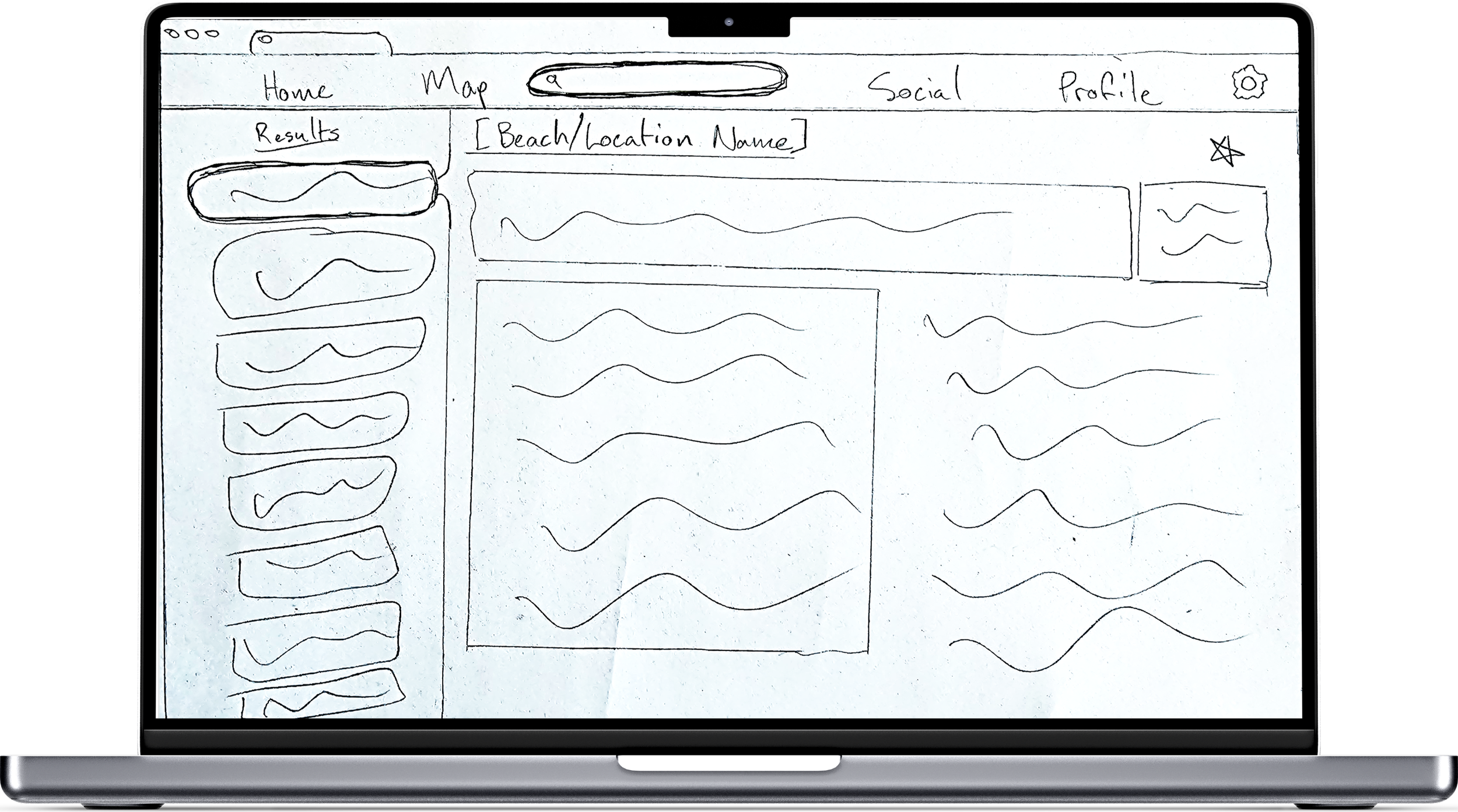
Social Page
03


Designing for the Long Run
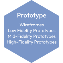
Step 4: Prototype
Creating a Design System
When I started diving into prototyping it was imperative that I also develop a fleshed out and polished design system that could drive long-term scalability of the application as well as be a resource for any designers that might join the project at a later date. While a design system is nothing new to the world of UX Design, it was important to cover the basics and ensure a thorough and thought out development of this figma file.
This was an extremely enjoyable part of this process; it paired the detailed and focus driven work that I love with intentional creativity and documentation. Soon the design system became a playground to develop new parts of the app in a secure file that once linked to my main design file, made it seamless to make updates to my design without having to do the bulk of my finetuning in my final design file.

Typography

Icons

Buttons
With this project being one of my first forays into the design world it was interesting to see how a design system can change over time as a living document of sorts that continues to be improved upon and tailored to the needs of the designer and the team. This resonated with me as there are always ways to improve design and my own work, so once a new idea hits you can jump right in and implement it via a design system.
You can view the design system version 2 that I created for this project by clicking on the embedded figma link in this section. Hopefully this can give you a quick look into the way I approach design as a UX Designer and some of the choices I implemented to try and stay accessible and up to industry standards when working on this project!
First High-Fidelity Clickable Prototype
Low to high fidelity prototypes were created based on the wireframing, focused on narrowing in on the users’ needs and goals for the prototype. The rapid prototyping process resulted in many different design decisions being made in very quick order. As you can see below, the first high-fidelity clickable prototype stage that we reached had four main pages: home, map, social, and profile as well as a search page.


Login Page
Home Page

Profile Page
Search Page
Social Page
Map Page


At this stage of the process, we had created a framework for users to save their favorite locations and see live updates concerning surf details on their home page as well as view the 10-day weather forecast for a specific location and any surf related news. A live weather map that they can filter to view certain conditions. The users have access to a social hub for planning surf trips with their friends in addition to being able to add their friends and message them.
To note here as well, the format of the information contained within the “favorites” section of the home page and also the information shown in the search page is loosely modeled after the late MagicSeaweed. This is a service that was mentioned in the market competitors section, as our user base had expressed their preference for MagicSeaweed’s UI over Surfline’s UI.
Returning to the Users
Step 5: Test
Preparing for Usability Testing
Users
We tested our first clickable prototype with 5 potential users of our application as well as 1 outlier who works as a front end developer. The 5 potential users included individuals who had surfed once or twice before all the way to individuals who surf multiple times a week when the weather permits.
Indirect Test Script Question
Before entering into any tasks for usability testing, we asked them the following:
“Spend some time looking over the home screen. Without clicking anywhere just yet, can you tell me your first impressions? What you like and don’t like, what you think about the information displayed on the page, or any other thoughts you might have? Remember to think out loud as much as possible.
Now that you’ve taken a look at the Hang 10 app, can you tell me what you think the purpose of the app is?”
Tasks
For the first task, we had the users open up the app and follow the process for signing up for an account and the onboarding process.
The second task was to add a beach to their favorites on their homepage so they could track the weather there throughout the day.
The third and final task was to plan a trip with a surfing friend via the calendar.
The Results
01
Confusion around onboarding (Rating Medium)
Suggested Change: A screen between sign up and onboarding stating that the user will be shown some key features of the app and then a banner at the top of the onboarding screens reiterating this as the part of the process the user is on.
Evidence: One of six participants were confused at first what the onboarding was before understanding it was documenting the features of the app. Other users understood but it took them a second to realize they had moved on to a new section.
02
Participants expected a back option from the search function (Rating Medium)
Suggested Change: Implement a back arrow that appears in the top left of the screen when the search bar is selected so the user can easily back track.
Evidence: 5 users looked for a back arrow after searching a location in the search bar and adding a favorite to return to the home page.
03
After adding a favorite, participant was looking for a confirmation notification (Rating Medium)
Suggested Change: When the user navigates away from the screen where they added favorites, have a success notification letting them know a location or locations were added to their favorites.
Evidence: One of our users found this flow needed something to notify him that he had been successful in adding a location to his favorites.
04
Flow for adding a favorite was not clear (Rating High)
Suggested Change: Gives users the option to search and add a favorite in three locations: by the favorites menu location, the search bar, and from the map tab.
Evidence: All participants navigated to the gear icon by the favorites section to add a favorite and not the search bar.
05
Participants were unsure where the calendar was located (Rating High)
Suggested Change: Separate the calendar and social tabs on the bottom navigation bar to allow for clearer navigation and more depth of information on each tab.
Evidence: 3 users were not 100% sure where the calendar was from the start and also wished for increased information along with the calendar such as upcoming events.
Revisiting the Prototype
Step 4: Prototype
User Feedback Updates
Major updates that were implemented following the usability testing included a new screen added at the beginning of the onboarding process informing the user that that they were going to be run through some of the key features of the application. A back button was added to the search function, a confirmation message was added after users added a favorite to their home screen, an add button was added above the favorites feature in lieu of a gear icon, and the social page was split into two pages, one for friends and one for the calendar.


Onboarding Intro Page
Search Page


Favorite Added Notification
Home Page


Social Page
Calendar Page
Accessibility
An important aspect of the application was to make sure it is accessible to as many users as possible. You never know when you may miss out on a whole swath of users just because you haven’t included them in the design process and planning. Additionally, it includes long-term design planning as accessibility standards are likely to become more and more entrenched in public policy as time goes on. To check accessibility standards and make updates the Stark accessibility plugin was used in Figma.
This part of the process felt impactful and very enjoyable. The accessibility updates didn’t just make it more accessible to different users, it also integrated to create a better and more thoughtful design. Great design and accessibility should not be mutually exclusive, they should instead inform each part of the process to create a fleshed out, and more cohesively useful design!
Color Contrast

Before

Before

After

After
Color contrast was checked for visibility as well as tested against all color blindness filters to ensure this would not be an issue for visually impaired users.
One of the major changes at this stage was to make the dark blue a more accessible dark as well as lightening the orange that was being used. Along with being friendlier to visually impaired users, it also was a more appealing visual contrast in general!
CTAs and Touch Targets

Before

After
Designing CTAs to be larger on the small screen size was a fun challenge to ensure that they were accessible with 44 dp by 44dp touch targets, but also not taking up a large majority of the screen. As you can see above, the icon size was increased and housed in a dark blue container. This helped the CTA to be cohesive on the screen while still ensuring accessible size as well as accessible color contrast.
Form Fields

Before

After
When updating the form fields, the placement of everything has to be very intentional. In the “before” picture the text in the field would disappear when the user clicks on the box making it so they aren’t reminded what they are typing in while they are actually filling out the form.
Throughout the app, this was taken into account. Visibility at all times with text for form fields and other informational queues were made clearer.
Along with these changes, all typography was double checked to ensure that there were no bodies of text smaller than 12 pt. Additionally, increased clarification was added to the event creation stage, showing the user in greater detail what step they were on overall and what their selection dates were on the first step of the event creation page.
The Product
Onboarding/Sign Up
The goal with onboarding was to keep information quick and efficient. The user should feel like the application is easy to access without too many barriers or upfront information while still understanding the app and functionality of the product.
Additionally, we wanted the emotional design to come through from the very beginning with specifically design icons placed in the sign-up flow and the app theme colors coming through at this early stage.
Favorites
I wanted to allow the user an easy way to add their favorite surf locations right to their homepage, so planning a trip or checking the weather for any given location is right at their fingertips.
Many users during the design process enjoyed being able to favorite locations as well as the additional feature being added to have a more detailed report of a single location for users.
Live Weather Map
A feature that interested many of our users was a live weather map that they could filter for different environmental conditions. The goal is to allow users to filter wind for surfing conditions or preview storm fronts moving into their area.
It was clear during the design process that this was a feature provided by all of the other competitors at different levels, so including a live weather map for the user base of Hang 10 was a key step to creating a competitive app.
Scheduling a Surfing Trip
The goal here is to allow users to quickly navigate to the calendar page to create a surfing event, flesh out any details they may want to add, then invite any individuals that they have friended on the app.
The social aspect of this app is meant to be one of the standout features, making it so that users can seamlessly plan trips with their friends at a moment’s notice if needed. The flow is meant to be simple while also covering all of the information they may need to convey to their social circle!
Hang 10 Figma Prototype
What’s Next…?
01
Refining Accessibility
Accessibility is at the forefront of our think with next steps when it comes to the Hang 10 prototype. Features that would be key to this pursuit include allowing users to customize the app font in the settings tab. The NNGroup covered accessible design in one of their podcast episodes and something that stuck out to me was that users with dyslexia were able to interact with text inside of applications when they could customize the font to something that visually worked for them.
Additionally, including a voice interface system into the application itself would be a major key aspect before putting the app to market to ensure that users with visual impairment could interact with the app. This would include ensuring the app is completely screen reader friendly and possibly even including a screen reader feature into the application.
02
Ironing Out Responsive Framework
Hang 10 is modeled as a responsive web app, next steps will be to flesh out the medium and large screen layouts as the small screen layout has been designed first as a mobile first design approach.
Additionally, I believe an important feature would be an ironed out responsive framework as well as a fully functioning Native app. Some users voiced that they prefer an app that they can download in lieu of a responsive app that they need to use a browser to access. This could also open up the potential for widget development in the future allowing users to have a part of our app right on their home screen to keep better track of weather conditions.
03
After Launch
To keep an edge going forward any revenue produced through either a pro membership or advertising would best be used to build a live webcam infrastructure that Hang 10 could use similar to Surfline as that is a key feature of visual verification for users.
Additionally, I believe that using some of the format of this app to develop similar apps for scheduling hangouts with friends who have busy schedules or creating a very accurate and in-depth weather forecasting app could be great ways to diversify the impact of the design already put into this application. Throughout my research oftentimes users already had apps or websites that they used for weather forecasting for example, but they were anything but satisfied with them.
Reflection…
Throughout the process of working on and developing the Hang 10 prototype, I learned so much it is hard to put into words. It is truly an interesting and impactful process to be creating something tangible while also learning the processes involved as you go. While also working on and developing this product, I was listening to different UX Design podcasts from NNGroup podcast to the Beyond UX podcast. Something that was very apparent to me was that good design takes time, there is no way around that. Doing solid user and market research, developing personas, flows, sitemaps, and wireframes are all key to the iterative process. This can be hard to balance with business objectives however, so it is important to thread that line when working on a product in the real work to ensure that all shareholders are provided with satisfactory designs in a timely manner. It is not only a UX Designers job to create a functional and thought-out design, but also to translate design thinking, processes, and results into a digestible form for developers, product owners, managers, and so on.
Additionally, throughout this process I learned that I really enjoyed the process of developing and finetuning the design system that I created for this project. It requires an amount of detail oriented and focused design work that is extremely enjoyable to me. You are able to pair the visually creative parts of the job with small detail-oriented decisions that then translate directly over to the functionality of the app.
Overall, this app was such a fun project to develop and I am very thankful to both my UX Tutor, Gabirel, and my Mentor, Priyanka, as well for helping guide me through this process with thorough and well thought out design advice. They helped me start to think in a new way and approach design with my eyes wide open.